


Duncan
LeBlond
Project Manager
In Drupal, the Rows and Cards interface can be used build structured Basic Pages and Landing Pages. This approach leverages an organized grid system. In Drupal, rows are typically defined by the layout builder or custom page templates.
The Tyler Colorado CMS Platform continues to support the content management tool from "Paragraphs: Rows and Cards. While the Rows and Cards functionality is no longer part of Drupal Core, Rows and Cards remains supported by and used throughout the Drupal community as a module.
As such, Tyler Colorado has committed to continuing to support this tool on the CMS platform, and we intend to support its availability alongside Layouts, which, as a part of Drupal Core, is the preferred and recommended tool.
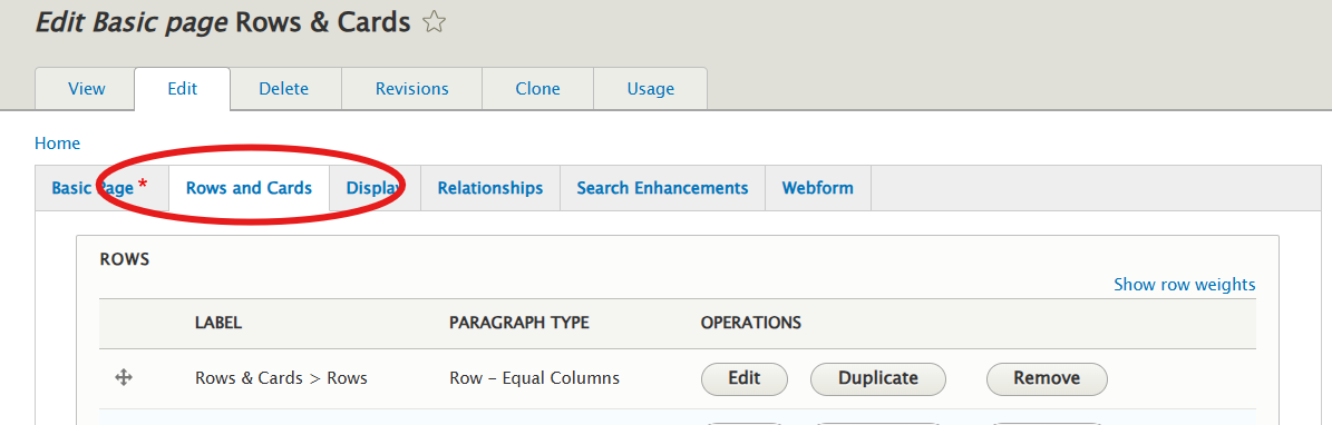
You can use Rows in Drupal to:
Types of Rows

A simple content container that holds information like a title, image, and description. Often used to display a single piece of content in a modular and compact format.
.
At vero eos et accusamus et iusto odio dignissimos ducimus qui blanditiis praesentium voluptatum deleniti atque corrupti quos dolores et quas molestias excepturi sint occaecati cupiditate non provident, similique sunt in culpa qui officia deserunt mollitia animi, id est laborum et dolorum fuga. Et harum quidem rerum facilis est et expedita distinctio. Nam libero tempore, cum soluta nobis est eligendi optio cumque nihil impedit quo minus id quod maxime placeat facere possimus, omnis voluptas assumenda est, omnis dolor repellendus. Temporibus autem quibusdam et aut officiis debitis aut rerum necessitatibus saepe eveniet ut et voluptates repudiandae sint et molestiae non recusandae. Itaque earum rerum hic tenetur a sapiente delectus, ut aut reiciendis voluptatibus maiores alias consequatur aut perferendis doloribus asperiores repellat.
A card that includes an embedded map (utilizing Google Maps) to show the location of a business, event, or place.
A card that uses a tabbed interface to display different sections of content in a single area. Users can click between tabs to view different information without leaving the card.
Sample Information 1, Sample Information 1, Sample Information 1, Sample Information 1, Sample Information 1, Sample Information 1, Sample Information 1, Sample Information 1, Sample Information 1, Sample Information 1, Sample Information 1, Sample Information 1,
Sample Information 2, Sample Information 2, Sample Information 2, Sample Information 2, Sample Information 2, Sample Information 2, Sample Information 2, Sample Information 2, Sample Information 2, Sample Information 2, Sample Information 2, Sample Information 2, Sample Information 2, Sample Information 2, Sample Information 2, Sample Information 2, Sample Information 2, Sample Information 2
Sample Information 3, Sample Information 3, Sample Information 3, Sample Information 3, Sample Information 3, Sample Information 3, Sample Information 3, Sample Information 3, Sample Information 3, Sample Information 3, Sample Information 3, Sample Information 3, Sample Information 3, Sample Information 3, Sample Information 3, Sample Information 3, Sample Information 3, Sample Information 3, Sample Information 3, Sample Information 3, Sample Information 3, Sample Information 3, Sample Information 3, Sample Information 3, Sample Information 3, Sample Information 3
A content card designed as a custom block in Drupal. Custom blocks are reusable elements that can hold content, images, or other components. (The block containing this site's footer is being used in the example)
Contact SIPA
Statewide Internet Portal Authority
720-409-5634
sipa@cosipa.gov
Contact Tyler Colorado
Partner Support
(303) 534-3468
A card that contains an embedded external content (e.g., video, social media posts, or external websites). It can include rich content like videos from YouTube, tweets, or embedded maps.
A card that uses an icon, as well as associated text and a hyperlink. In this way it functions as dynamic, clickable content that works similarly to a Button. Note that buttons can also be created in the CKEditor.
A card that displays a specific image from the Media Library.
A card designed to display a designated Contact.